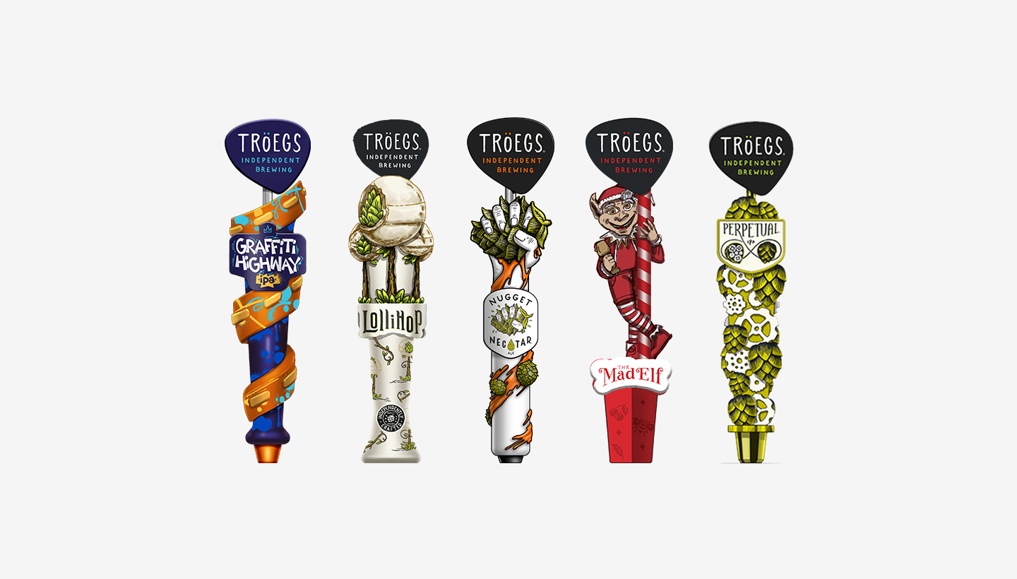
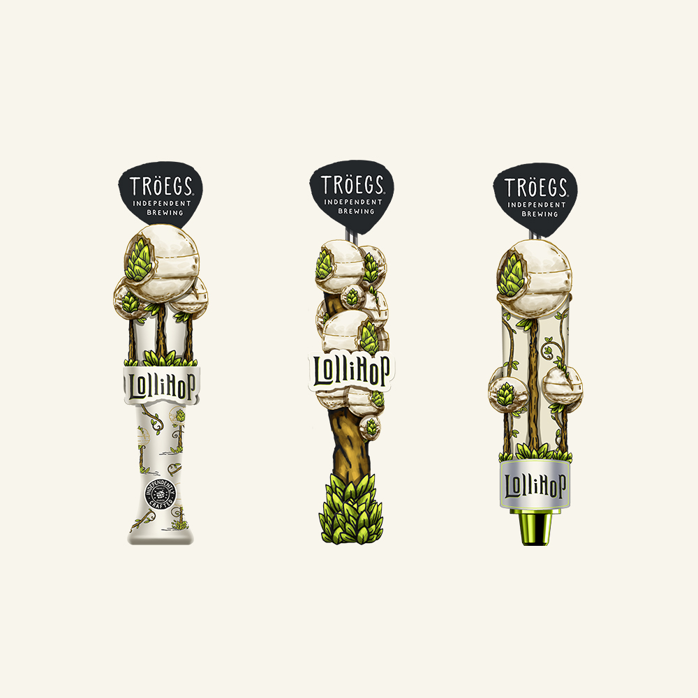
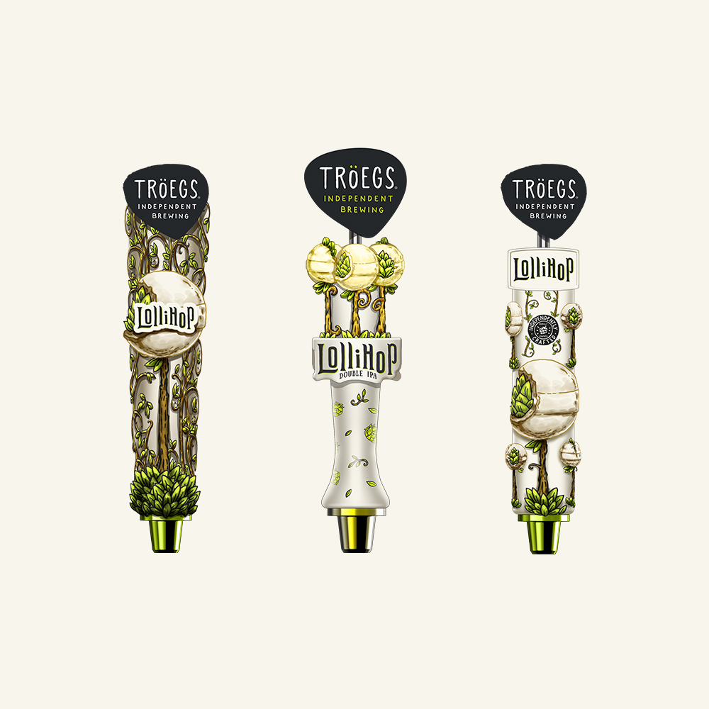
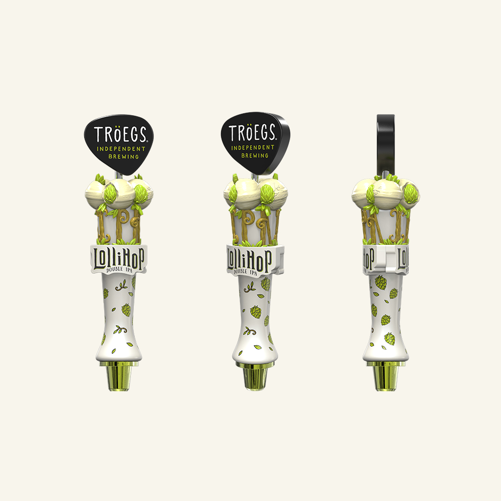
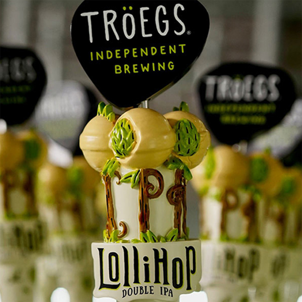
Case Study
Tröegs Tap Handle Redesign

Translating new visual identities to powerful on-premise marketing tools

The Challenge: Highlight Updated Visual Identities While Ensuring Masterbrand Recognition

The Tröegs family-owned brewery desired to translate their new, distinctive beer branding into a vibrant reality. Embodying their passion for the brewing process, the updated artwork featured reimagined brand elements and hand-drawn fonts. The challenge was to ensure that each design concept simultaneously communicated uniqueness and individuality while maintaining a cohesive visual identity as part of the Tröegs family of beers.

The Solution: Create A Family Of Tap Handles That Showcase Each Brand’s Expressive Personality

We engaged in a close collaboration with the Hershey, PA team to craft a series of sketch concepts that would complement the launch of Tröegs' updated packaging. The Taphandles team produced a set of designs that enhanced the prominence of each brand's key elements, ensuring that the visuals were not only memorable but also easily recognisable as part of the family of brands.

Lollihop Double IPA: A Closer Look

Explore the LolliHop Double IPA design from concept ideation through to reality. The initial stage explores multiple ideas for elevating the key brand elements of hop-filled lollipops growing out of the hand-drawn hop bine/lollipop stem “IPA” script. Once a concept was selected, we transitioned into digital sculpting and photo-realistic renderings. The fourth image captures this concept in it’s final stages before being wrapped, packaged and delivered!

The Outcome: Unique Yet Identifiable

A distinct family of sub-brands coexisting under the unmistakable umbrella of the Masterbrand. Each bears the immediate recognition of being a Tröegs beer, yet possesses a unique personality achieved through meticulous character development.

Partner With Us